
SDSU Student Symposium
LOGO DESIGN
With the goal to attract and include students from all majors across campus to participate and embrace their diverse discoveries, innovations, and creativity, I have created a logo mark that represents community and culture. Inspired by SDSU's iconic architectural features, these three arches represent the diverse thoughts the students at SDSU have as they walk through campus. The arches were created from the S of its font pairing called Noka, which is a powerful geometric sans serif with features that tie to innovation and the future. Furthermore, the three arches represent an abstract interpretation of the S cubed, with three elements to create one.


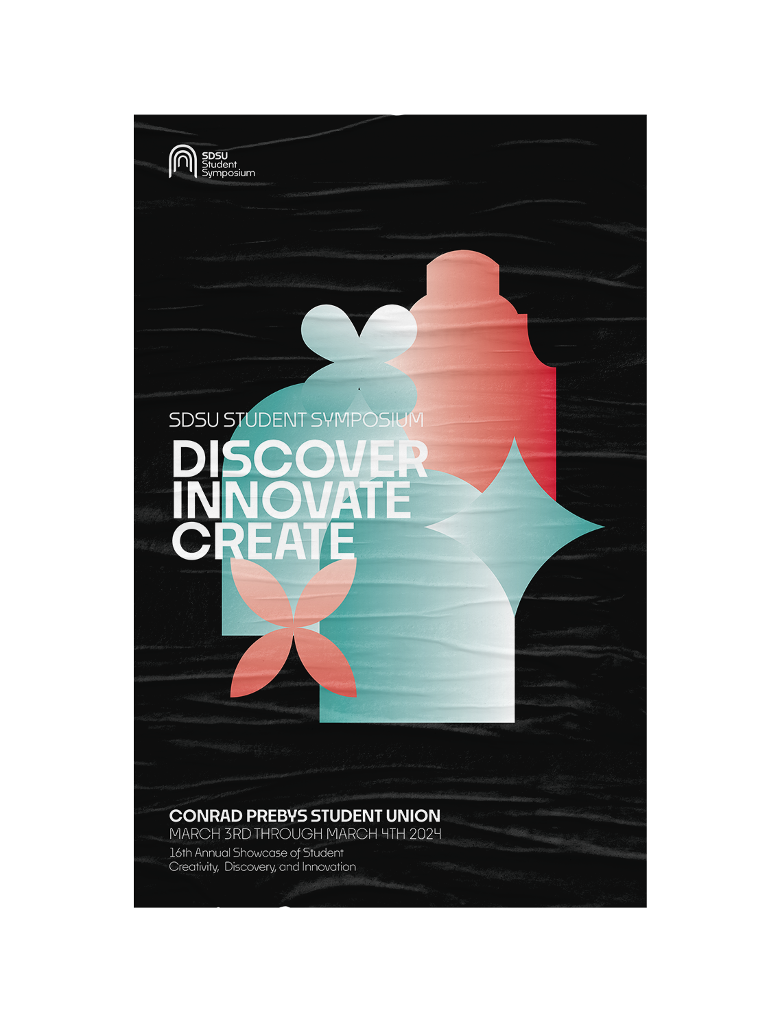
SOLUTION
Here are some representations of how the logo could be presented in, such as on a water bottle, and a poster. This poster was designed to attract and embrace students from all majors to showcase their discoveries, creativity, and innovations. Similarly to the logo, the icons presented in the poster are inspired by SDSU’s architectural features, tying in an abstraction of innovative thoughts and the diverse student culture at SDSU. The icons follow the arches of hallways, Hepner hall, and the details seen on railings and windows. The colors here are SDSU’s brand colors, transformed into a gradient to allude to student’s modern, creative, and innovative ideas. Along with the poster is a designed Instagram post for the brand system. The high contrast and eye-catching elements in both the poster and Instagram post attract and inspire students to become interested and participate in the event.
October 2022 — Adobe Photoshop — Adobe Illustrator — Brand Indentity — SDSU Student Symposium